
AI Filter Assist
AI Generated Filter Assist
Overview
The goal of this project is to enhance the customer browsing experience through an AI-powered guided filtering solution. By highlighting the most relevant filters, the experience aims to help users discover products more quickly and easily - ultimately improving overall satisfaction and shopping efficiency.
The project follows an agile approach and is structured in two phases, both leveraging Google’s Cloud Retail Solution (Google Search Filters and Blackbox):
Phase 1 (current): Launch an A/B test for the guided filtering feature in Q2. This version surfaces the most contextually relevant filters to assist users in narrowing down product selections seamlessly.
Phase 2 (upcoming): Introduce “Top Filters” and take a holistic approach to all filtering features, further optimizing the experience based on insights from Phase 1.
Phase 3 + future roadmap: Product Information Q&A Bot and Conversational AI.
Design Process of Project Phase 1: Filter Assist
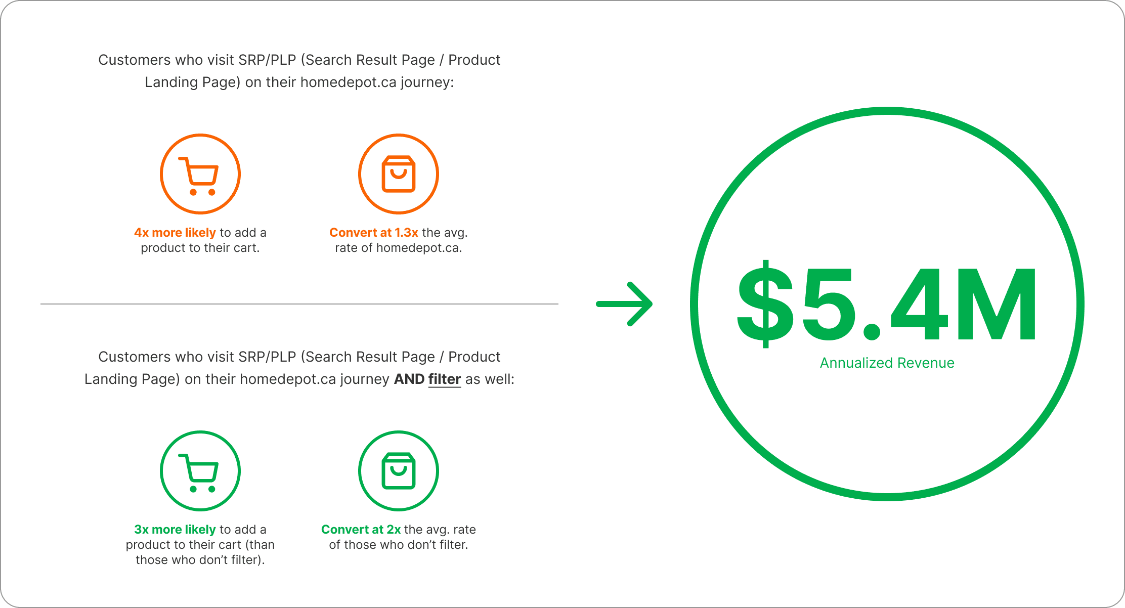
The Value of Improving Filtering Experience - why do we have to do this?
Getting more customers to filter will drive $5.4M of annualized revenue.
Problem Statement
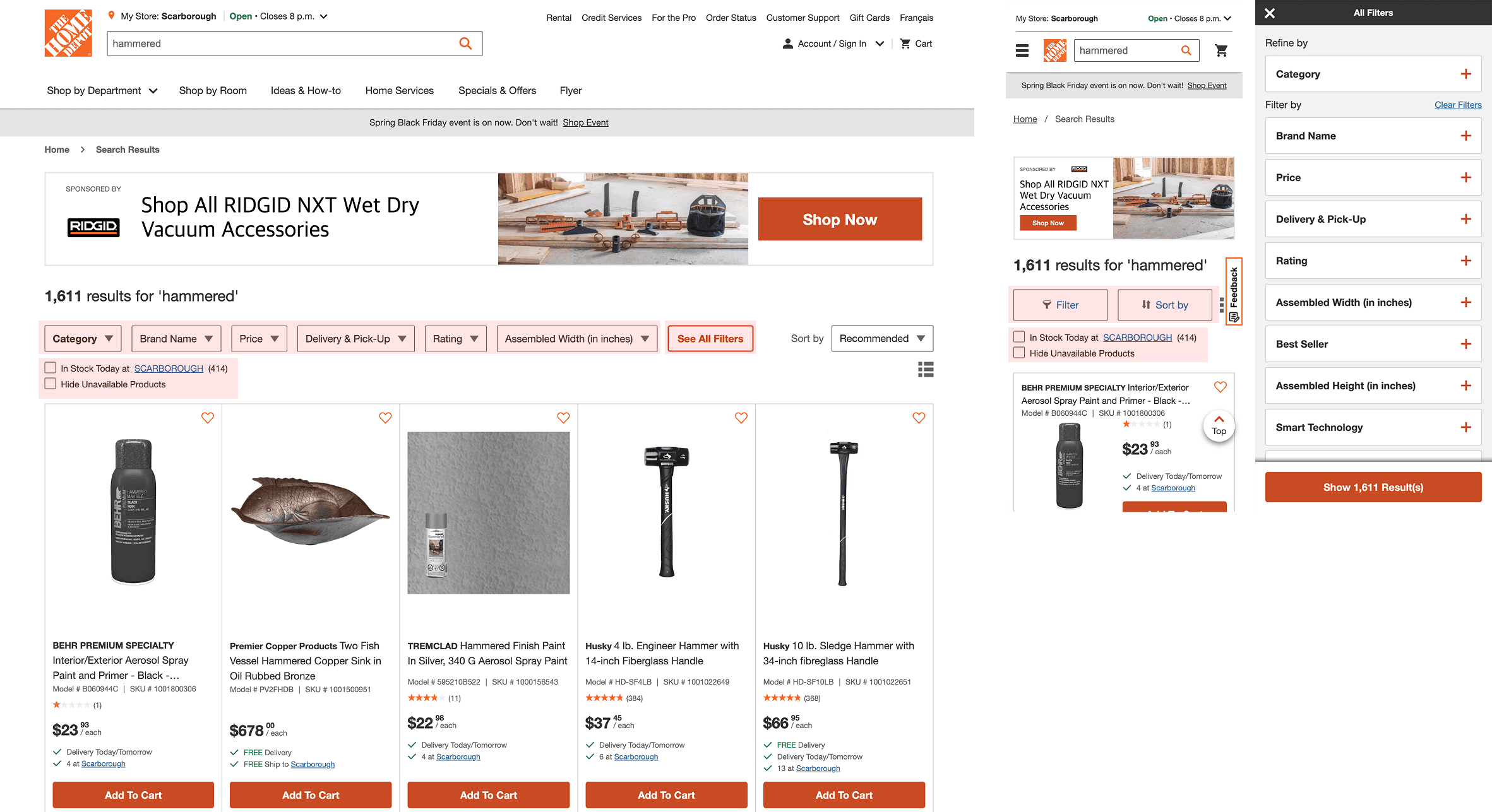
Currently, filters are buried within dropdowns and filter panels, making it difficult for customers to efficiently find and apply relevant options. Some filter labels are ambiguous and unclear to general users, while key filters are often hidden from immediate view.
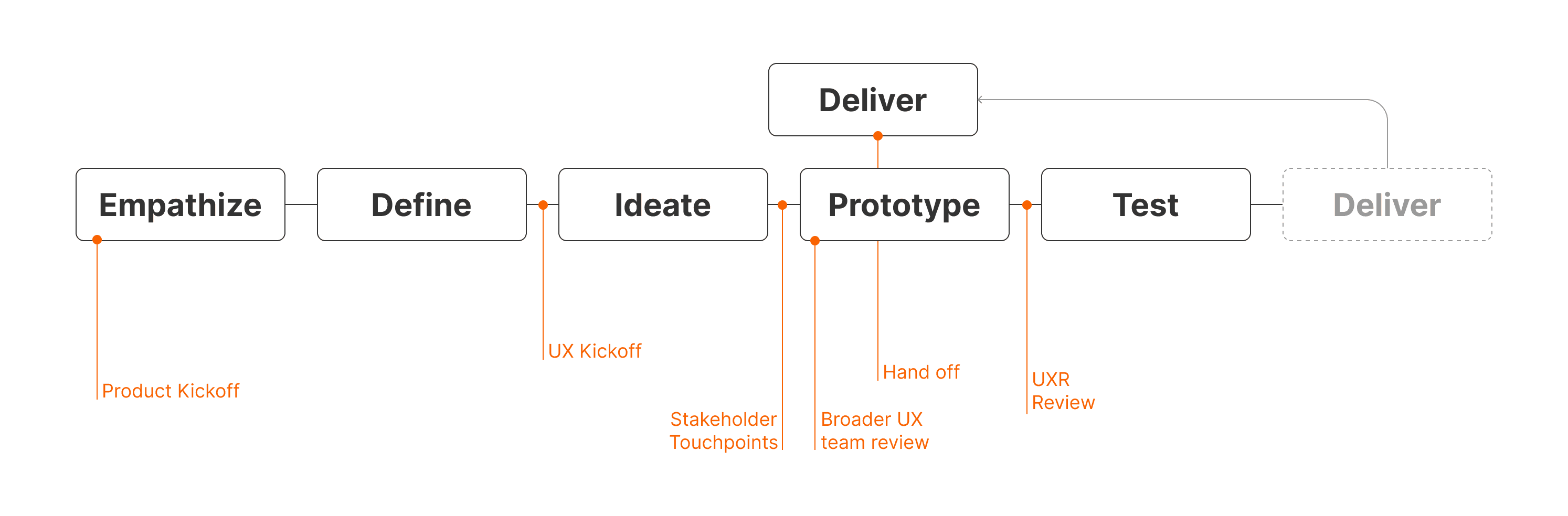
Empathize
Given the tight project timelines, the UX team needed to move quickly while still grounding our work in meaningful insights. We began by gathering as many resources as possible to guide our approach, with a specific focus on creating an effective filtering experience for the home improvement customer segment.
Our early research efforts to empathize and define included reviewing relevant UX literature, internal audits and researches, UX backlog, and analyzing competitor experiences both within and outside our industry, and collaboratively identifying key opportunity areas as a team.
Primary & Secondary Research
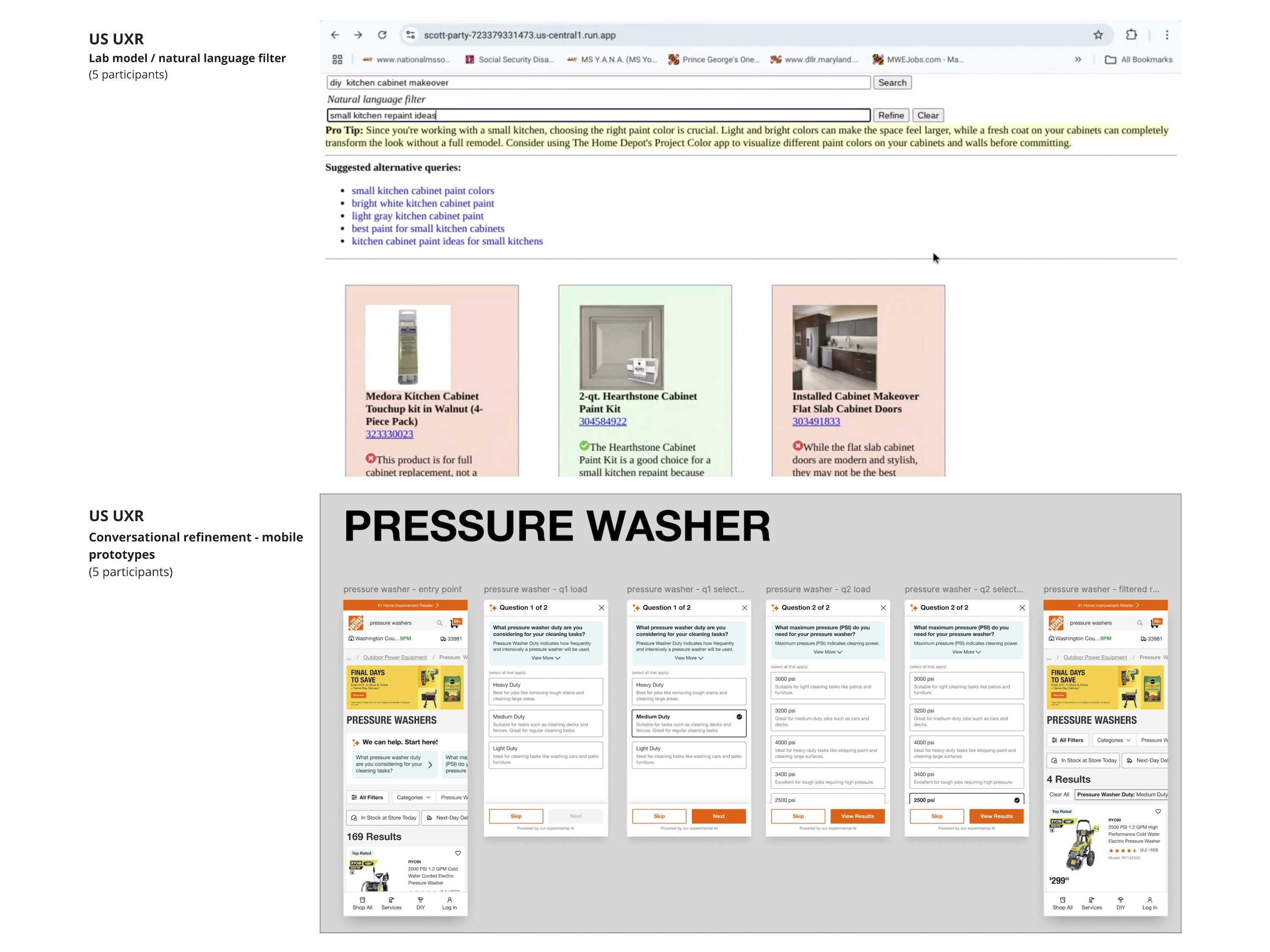
Some important learnings came from our literature review which shaped our strategy moving forward.
Users prefer clear and easy-to-understand filters.
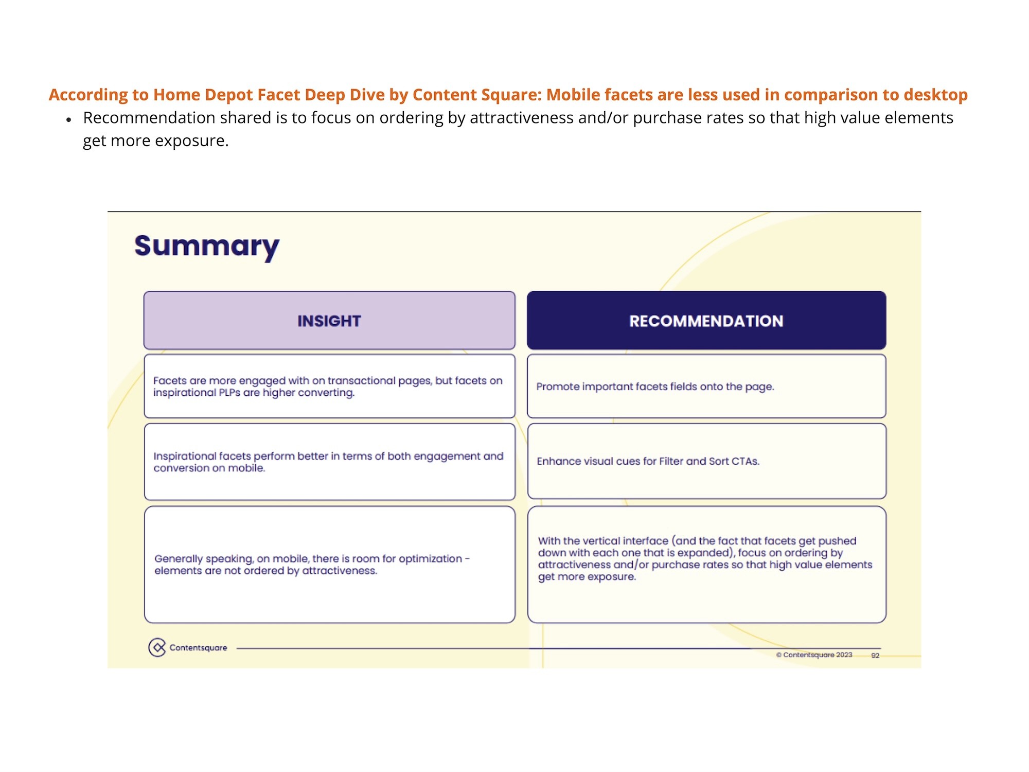
Mobile facets are less used compared to desktop.
Browsing is not just about item selection, but learning about what to buy.
Users engage with filters significantly less on mobile, indicating lower conversion rates.
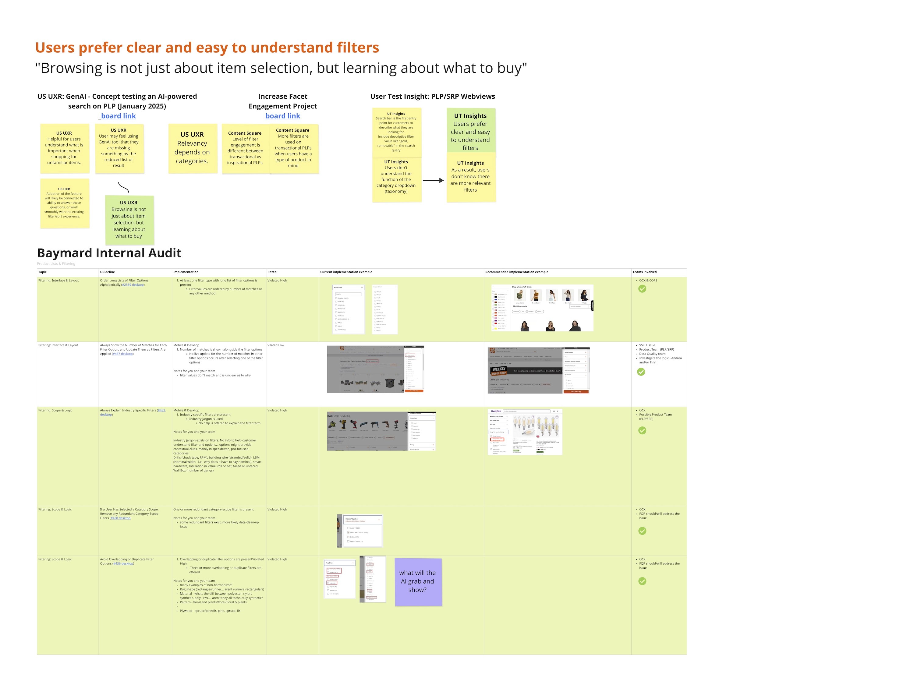
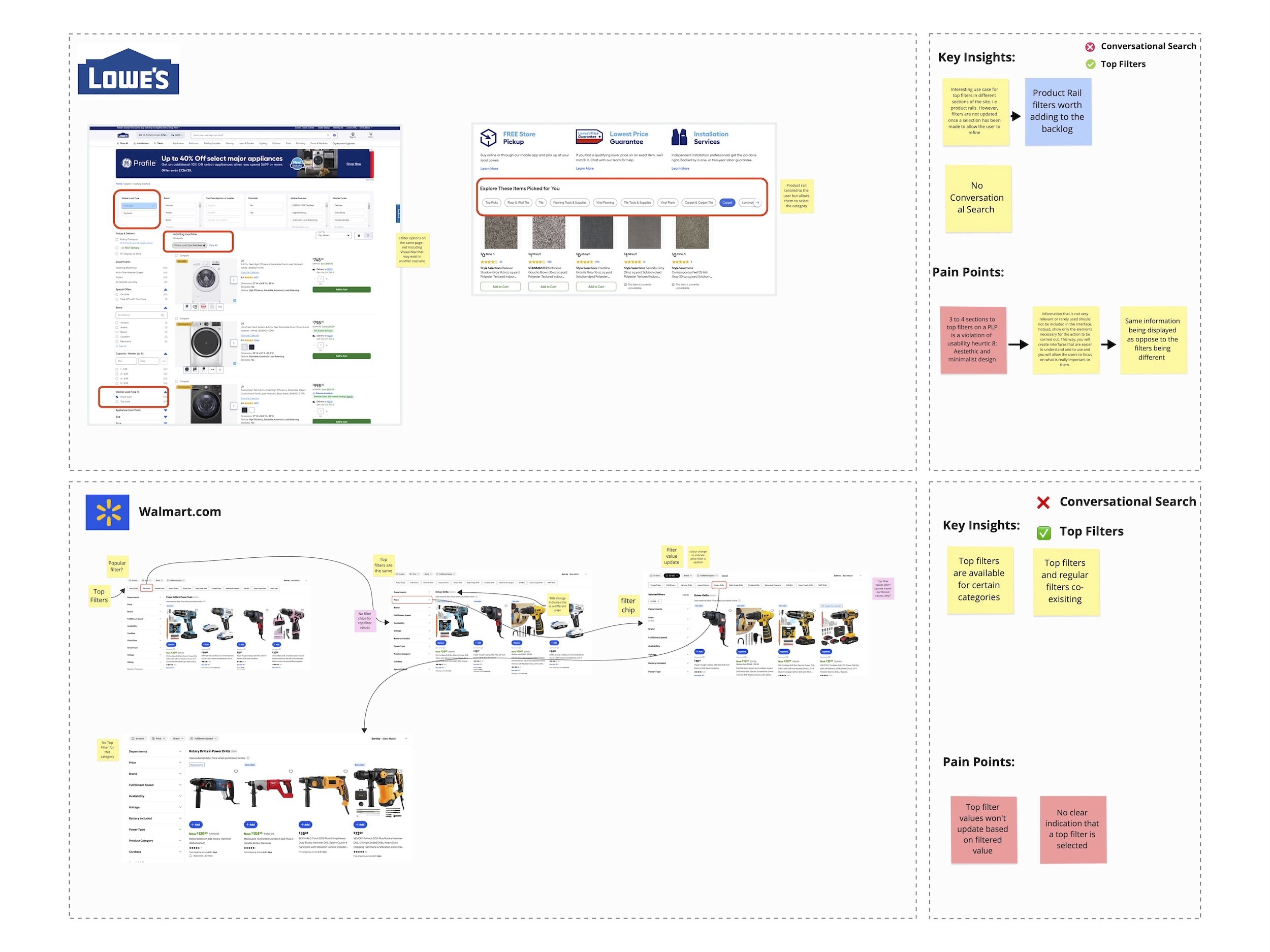
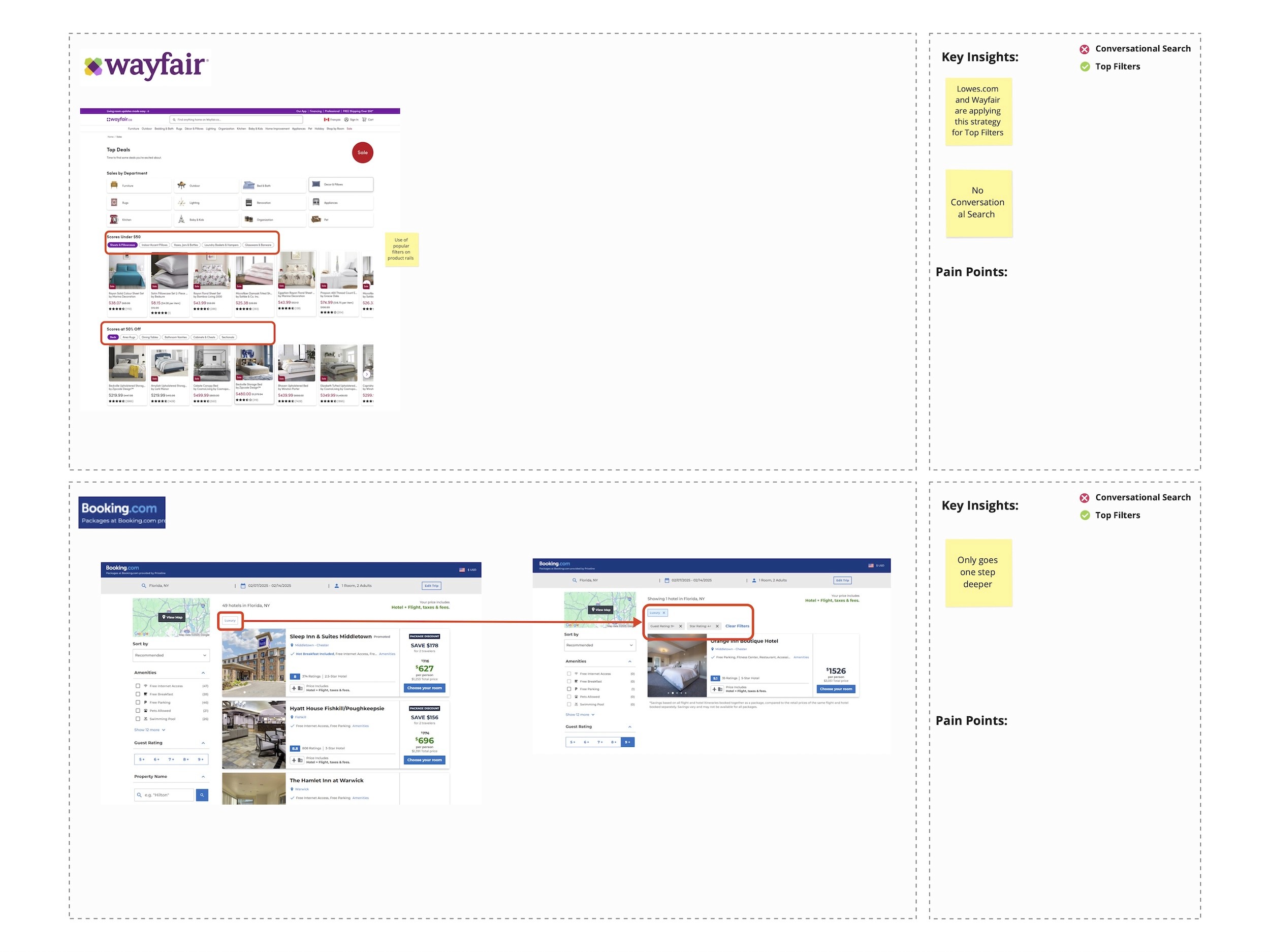
Competitive Analysis
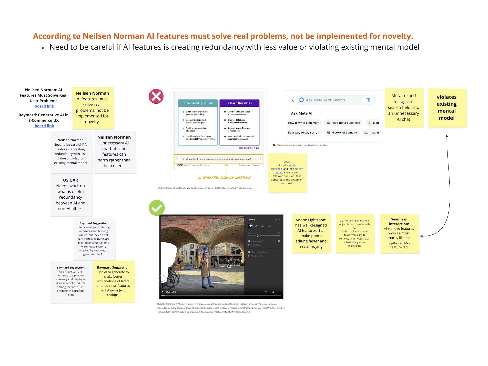
Looking into various competitors, we were able to learn that that AI-generated filtering interfaces are still relatively new in the market. While many brands are beginning to explore AI in filtering, it’s clear that such features must solve real user pain points - not just serve as novelty experiences.
We analyzed competitors from multiple angles and surfaced a few key insights:
Two main approaches emerged across the market:
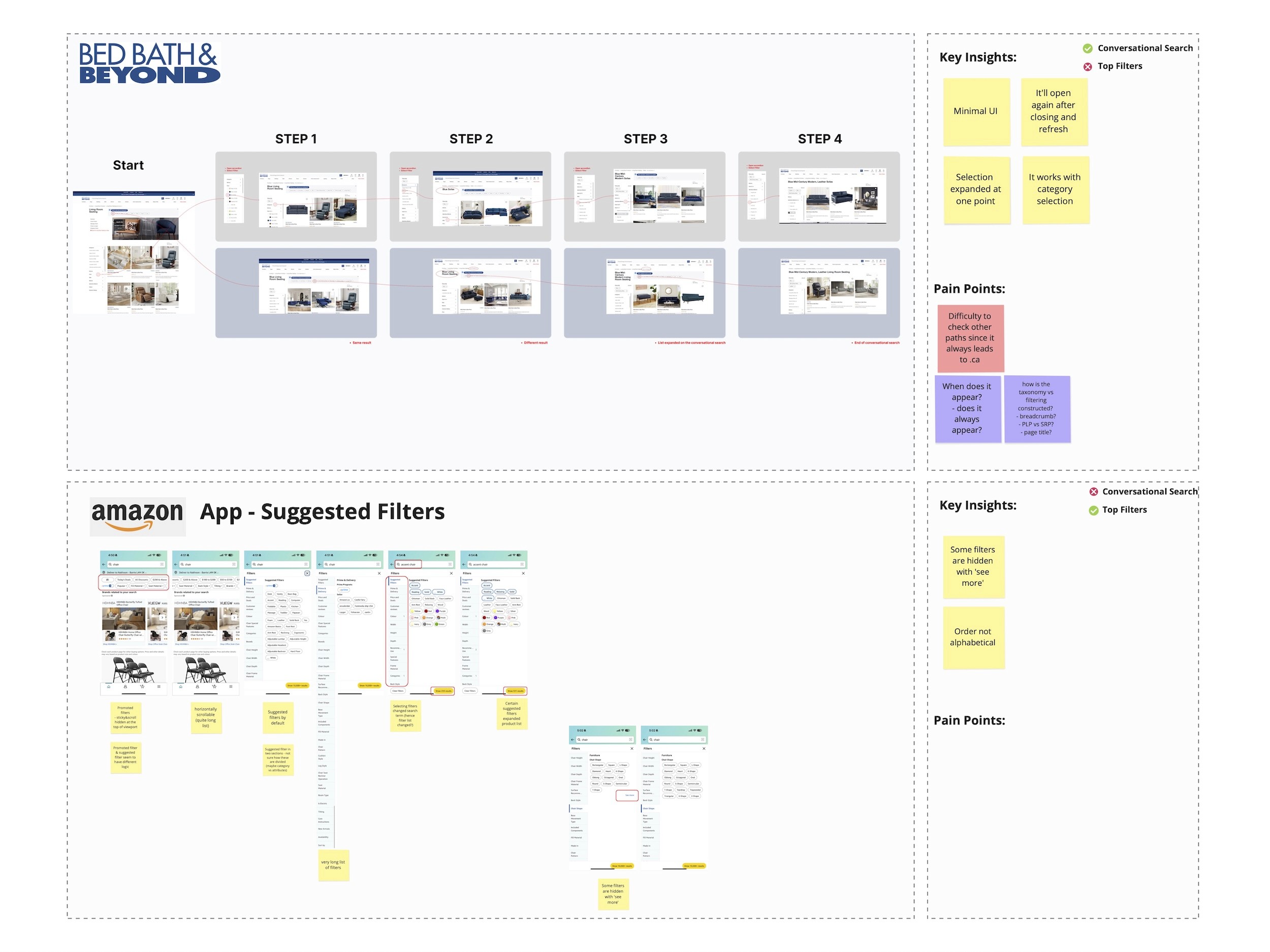
Conversational filtering, where users interact with a question-and-answer interface (currently, Homedepot USA and Bed Bath & Beyond are the only two websites to have this feature).
Promoted filtering, where certain filters are visually highlighted or surfaced based on assumed relevance.
Redundancy in filters was observed in platforms like Lowe’s and Walmart, where multiple filtering options were presented without clear prioritization or user guidance - potentially leading to decision fatigue.
Bed Bath & Beyond and Amazon offer what appears to be “guided filtering,” but their experience sometimes broadens results rather than narrowing them. This could indicate a strategy focused on encouraging product exploration rather than efficient narrowing.
Define
Using the insights gathered during the research phase, the UX team redefined the core problem statement to focus more directly on user pain points. These pain points were then translated into How Might We (HMW) questions to guide targeted, innovative ideation. This approach helped align not just the UX team, but also stakeholders, around solving real user challenges.
Problem Statement
Initial Problem Statement (from product kickoff):
How might we make it easier for customers to filter, show customers more personalized filters, and encourage customers to filter more often?
Refined UX Problem Statement:
Currently, filters are buried within dropdowns and filter panels, making it difficult for customers to efficiently find and apply relevant options. Some filter labels are ambiguous and unclear to general users, while key filters are often hidden from immediate view.
Pain Points
Ambiguous filter labels that require explanation
Important filters are hidden or not easily discoverable
Filter lists are long and not always contextually relevant
HMW (How Might We)
How might we create a guided filtering experience that surfaces relevant options upfront - helping customers explore, understand, and select products more easily and efficiently?
UX Kickoff
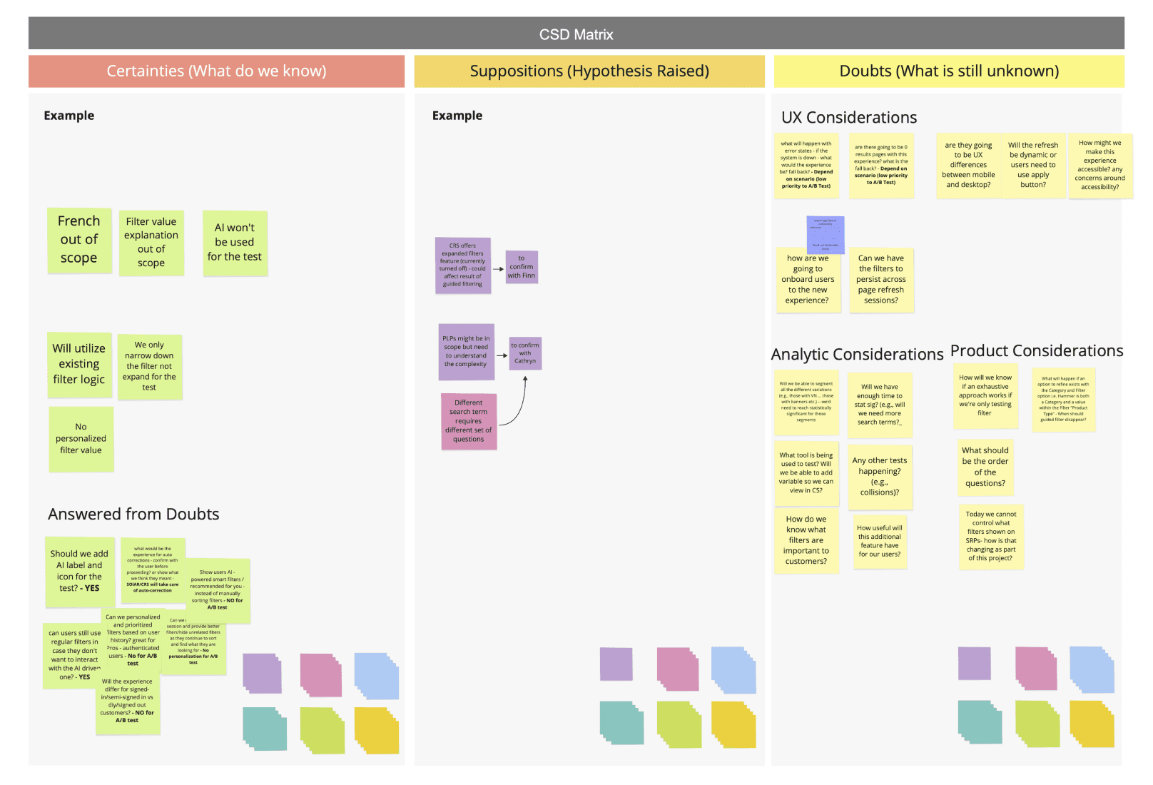
After presenting our research findings to the sprint team and stakeholders, we collaboratively identified key UX opportunities that would best support our Home Improvement persona. To refine the project scope and align on priorities, we facilitated a CSD Matrix (Certainties, Suppositions, Doubts) workshop.
This exercise helped the team clearly define:
What’s in scope
What’s out of scope
What should be considered for future phases
By aligning early, we ensured that all stakeholders—UX, Product, and IT—were on the same page. We prioritized features into:
Must-haves for Phase 1
Nice-to-haves for future iterations
Ideas to revisit as the project evolves
Ideate
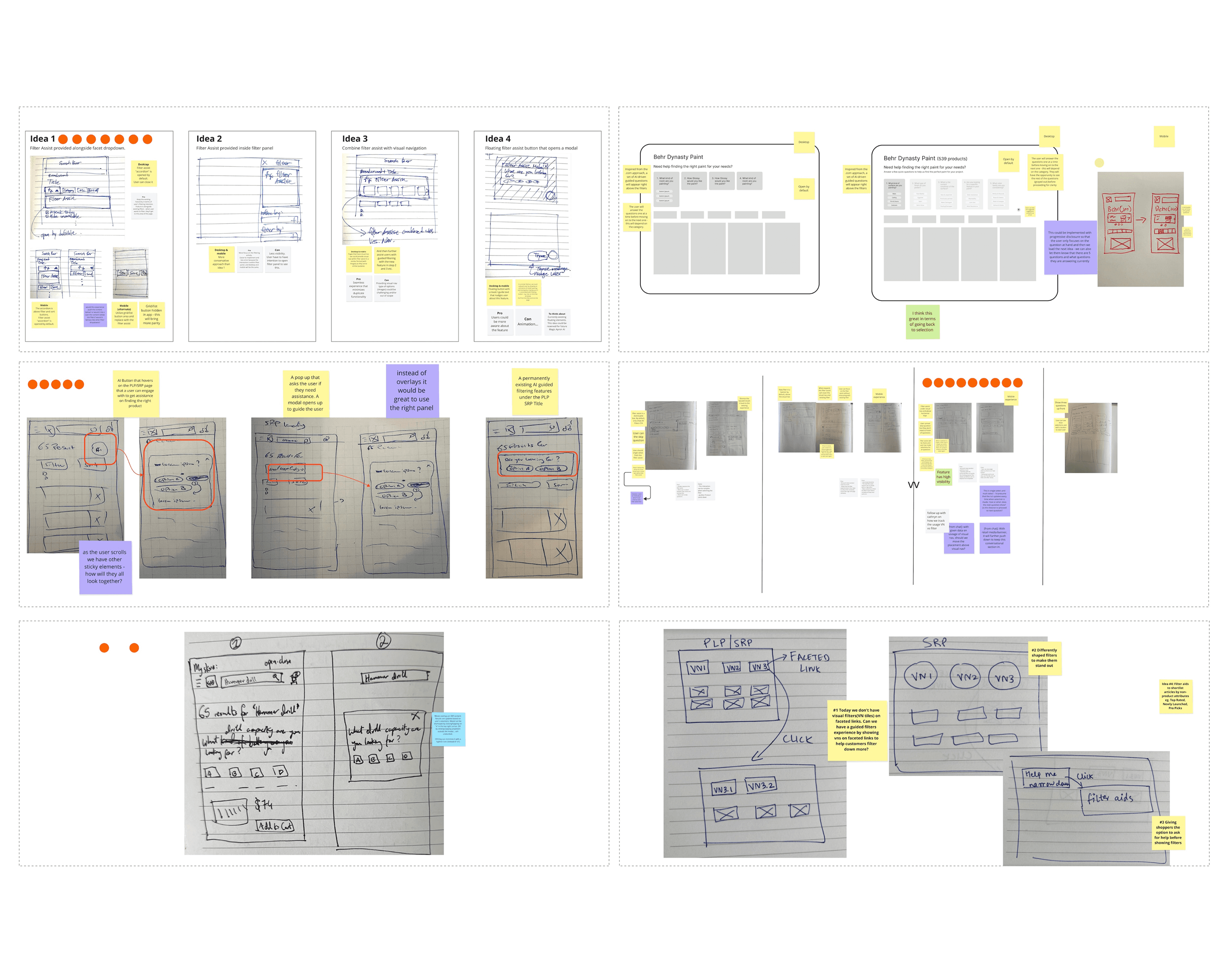
We held an ideation sprint session with stakeholders to ensure collaboration and alignment on the direction of the solution. During this session, we facilitated a Crazy 8s sketching exercise, where each participant sketched eight quick low-fidelity ideas to explore different concepts.
After sketching, stakeholders and designers walked through their ideas, explained their design choices, and engaged in open discussion through Q&A. The team then voted on the strongest elements from each idea, which helped us identify promising patterns and directions given current scope of the project. Some of the ideas would be backlogged for the phase 2 of the project.
These top-voted ideas were synthesized into a single, more formalized concept. From there, we developed a mid-fidelity design, which went through a series of reviews with stakeholders and the broader design team. This iterative feedback process helped us refine the solution into a high-fidelity design. Following that, we began organizing both the UX handoff and our usability testing plan.
Low-fi & Mid-fi
Deliver
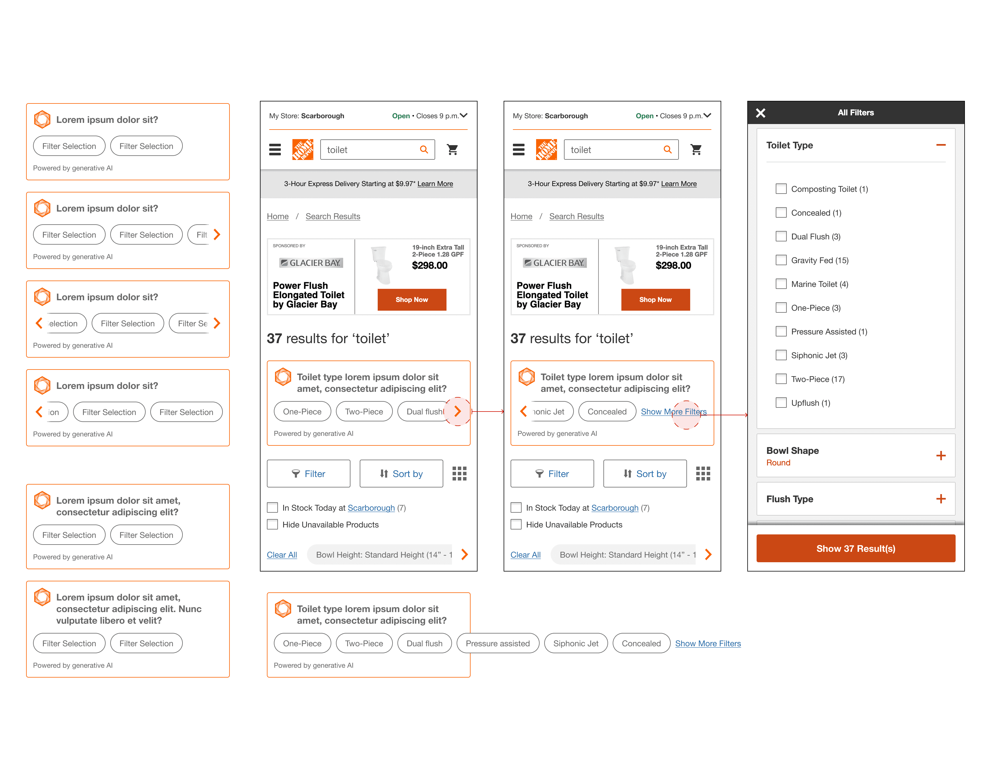
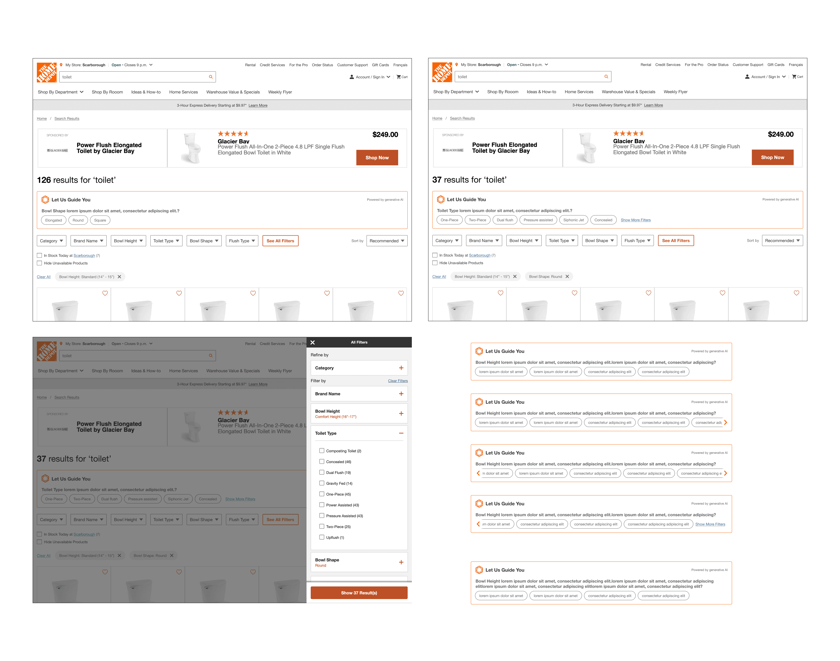
High-fi Design and Specifications
As mentioned earlier, this project followed an agile approach. Due to the tight timeline for the A/B test launch and development requirements, user testing was not part of the product team’s objectives for Phase 1.
Instead of the typical design–test–iterate cycle, the UX work was handed off to the product and development teams to ensure the feature could be built and launched on time.
However, the UX team proactively planned and conducted usability testing independently to identify potential usability issues, ensure we weren’t introducing new problems, and gather insights that could inform Phase 2 of the project. This helped maintain a user-centered mindset, even within the constraints of an accelerated delivery timeline.

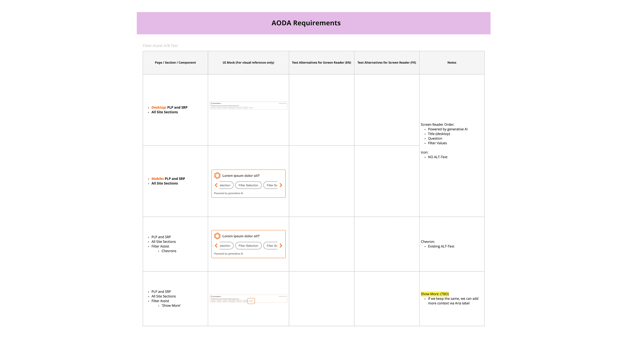
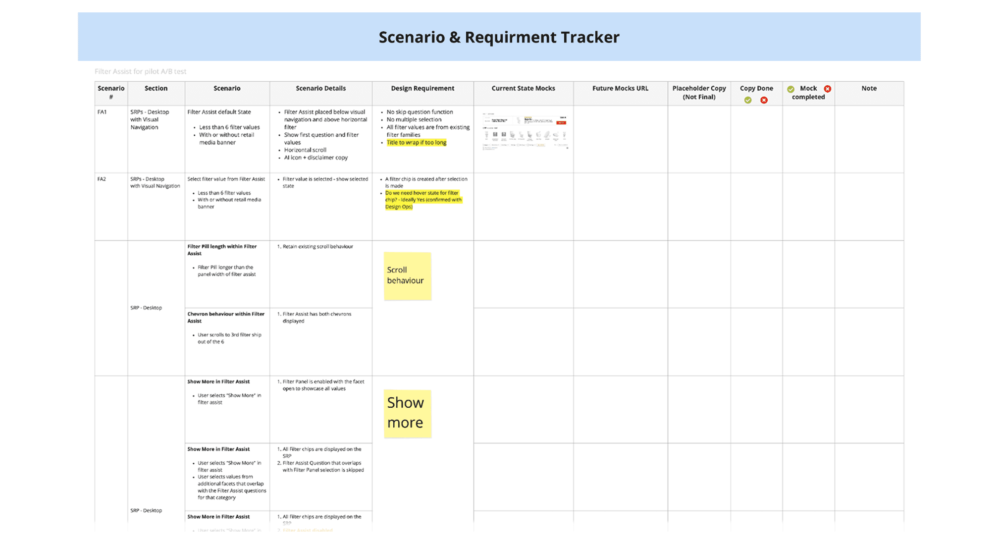
AODA & Scenario Requirement Tracker
Accessibility is a core part of our design and development process. For every project, we ensure that new solutions are designed with accessibility (AODA) standards in mind, while also reviewing and addressing any existing accessibility issues as part of the project scope.
In parallel, we identify and document a wide range of user scenarios - from happy paths to edge cases - to ensure the experience is inclusive and robust. These scenarios are tracked on a centralized board, helping the team align on experience expectations and validate coverage during User Acceptance Testing (UAT).
Prototype and Test
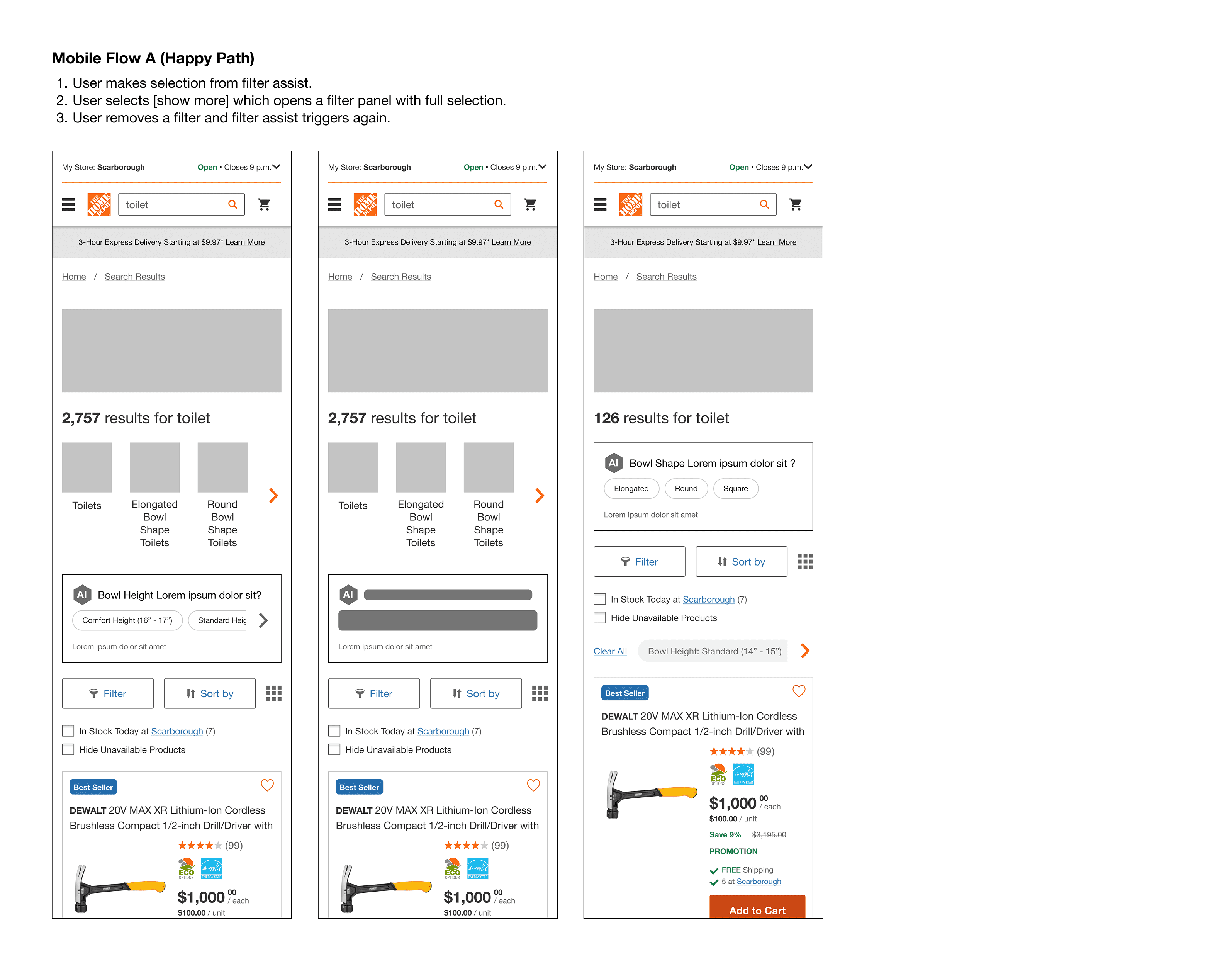
Test Setup & Objectives
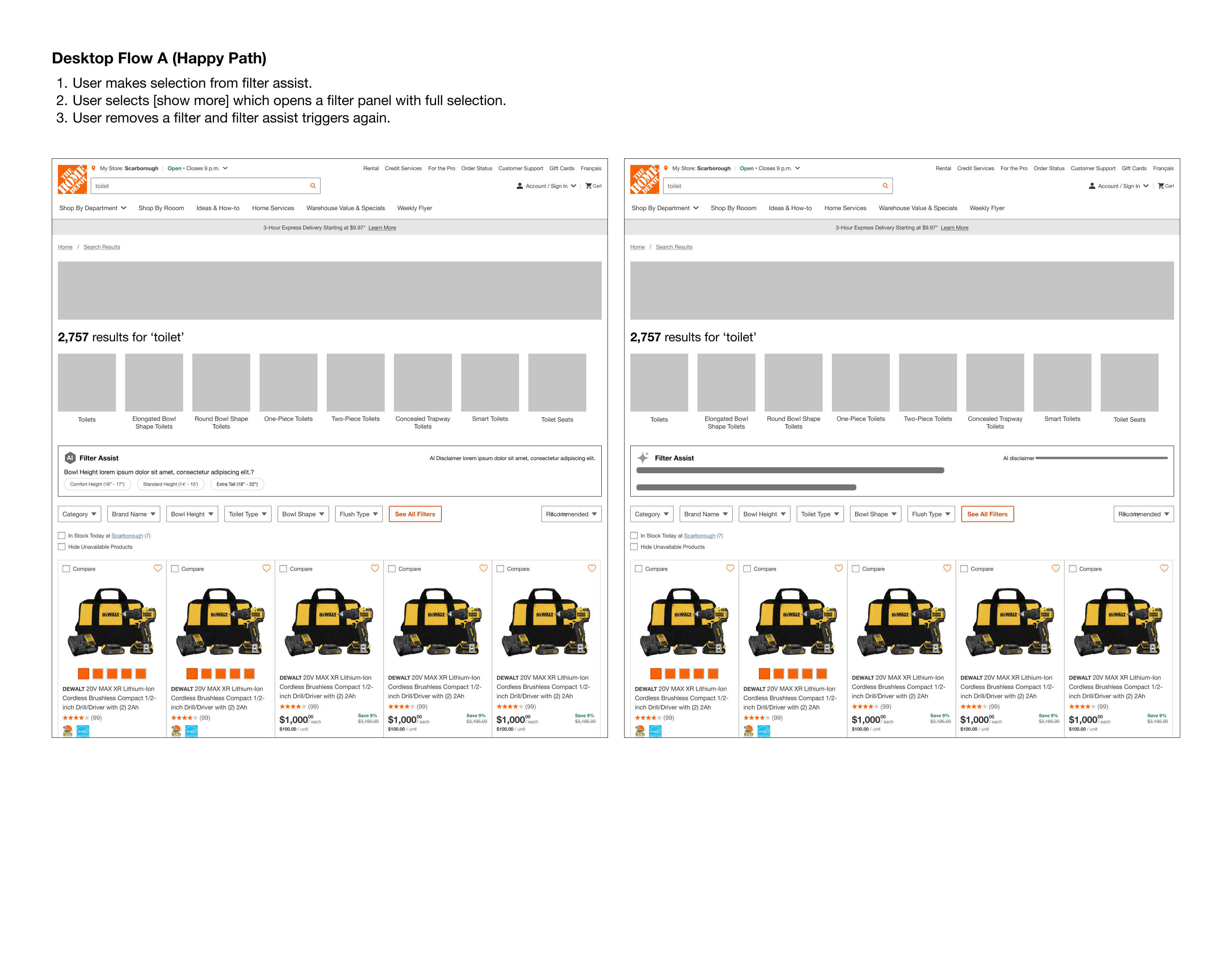
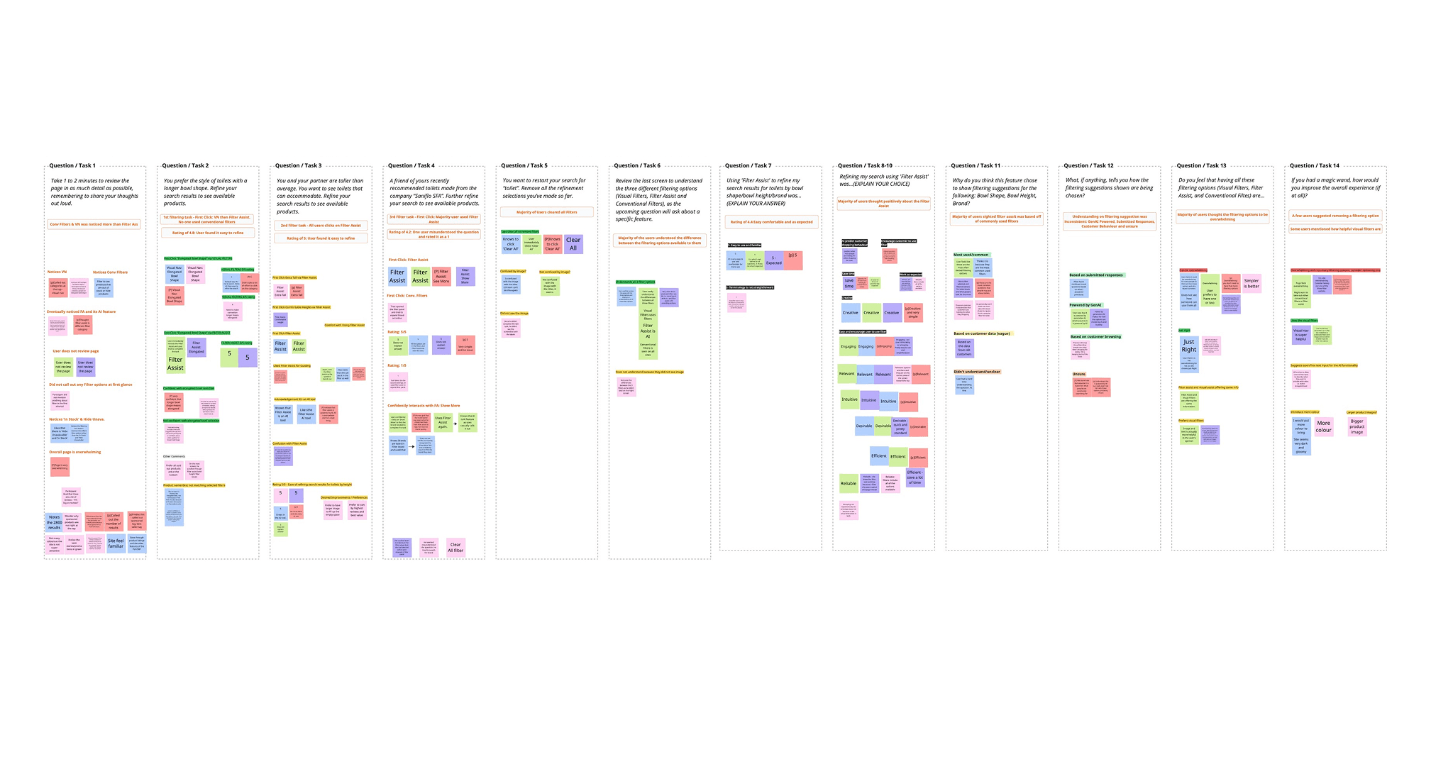
To evaluate the value and usability of the new AI-powered Filter Assist, we conducted moderated usability testing across both desktop and mobile browsers with a total of 10 participants. The test aimed to simulate a real-world DIY shopping scenario involving toilet selection.
We focused our research on three main questions:
Do users notice and engage with Filter Assist compared to other filter types?
Do users understand how to use Filter Assist, and what challenges do they face?
Do users recognize that the feature is AI-generated, and what are their expectations?
We also tested assumptions such as:
Filter Assist would make filtering feel easier and more inviting.
The current product listing page is overwhelming.
Surface-level AI guidance would increase filter engagement.
Prototype
We used Figma and Protopie to build interactive prototypes for testing. All filtering entry points were included to ensure we could effectively observe and evaluate the research questions outlined earlier.
What We Learned
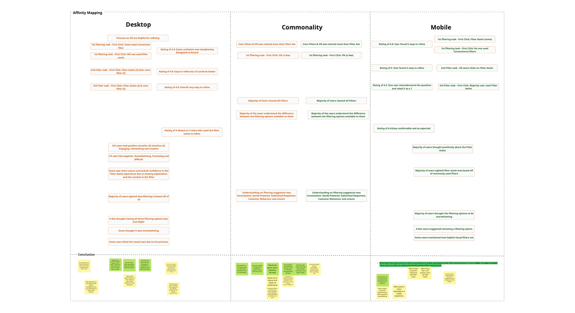
We collected both behavioural (clicks, navigation) and attitudinal (verbal responses, emotions) data to understand usage patterns and overall perception. The UX team went through ‘affinity mapping’ sessions to synthesize the results into several themes of insights:
Common Insights
Visual Navigation was highly used and appreciated for helping users quickly understand and narrow down options.
Filtering options felt overwhelming, and users didn’t want more added to the page.
Filter Assist was used by most users, even if they didn’t fully understand how it worked.
Mobile-Specific
Users preferred Filter Assist over Conventional Filters when Visual Navigation wasn’t available.
Despite higher usage, mobile users still found the overall experience overwhelming.
Desktop-Specific
Users were hesitant to use Filter Assist at first, especially when all filter types were visible.
Some users leaned on Conventional Filters out of habit.
Opinions were mixed - some found having all four options “just right,” while others felt it was too much.
Next Steps
Based on our usability testing insights, we’ve identified key opportunities to refine the filtering experience - particularly around reducing cognitive load and improving feature clarity. This qualitative data (usability testing) will be combined with quantitative data from A/B testing (to measure user behaviour at scale) and leveraged in Phase 2 to create a more holistic filtering solution.
Key takeaways for Phase 2:
Refine the balance between different filtering methods, with the addition of the Top Filters functionality.
Prioritize updates that reduce overwhelm, improve the clarity of each filter type, and better tailor the experience for both mobile and desktop users.