
Webviews in App
Introducing webivews in iOS and Android app
Overview
The Product Information Page (PIP) and Product Listing/Search Results Page (PLP/SRP) Webview projects were UX initiatives aimed at closing the experience gap between The Home Depot mobile app and mobile web experience. While each project focused on different parts of the customer journey, they shared a common goal: to bring feature parity and consistency across platforms, ensuring that customers - whether DIYers, PROs, or guest users - could shop with ease, regardless of channel.
Through close collaboration with cross-functional teams and an iterative, user-centered design process, we enhanced accessibility, reduced friction, and streamlined key shopping flows, while accelerating time to market and reducing development costs.
Objectives
What We Mean by 'Webview in App'
And how it compares to the Mobile Web and Native App.

Challenges
This project involves solving platform-wide issues - we weren’t solving for a single feature or journey, but addressing a larger problem that spanned multiple parts of the user journey. Each of the PIP/PLP/SRP pages includes many features, and those features are often owned by different product teams.
Our key challenges:
Identifying and prioritizing problems across a wide set of features and flows.
Gathering input from multiple teams with distributed ownership.
Aligning stakeholders with differing goals toward a unified direction.
Research
Zoning Analysis
We began by breaking down key screens (PIP, PLP, SRP) into zones and comparing experiences across mobile web, iOS, and Android.
This helped us:
Identify which features were present, missing, or inconsistent across platforms.
Spot opportunities for consolidation or improvement.
Highlight gaps in navigation patterns and user expectations.
Create a shared reference point for alignment across teams.
Outcomes:
Defined which features could be enabled in the app via WebView.
Identified app-specific features worth retaining.
Highlighted enhancements for both the app and mobile web.


Literary Research: Baymard and Internal UXR
To inform our design decisions and ensure platform-appropriate solutions, we conducted a mix of literature review (Baymard Institute) and internal UX research. This phase focused on identifying best practices for mobile commerce, understanding platform-specific behaviors, and surfacing opportunities to improve key areas of the experience.
We categorized findings by feature groupings to align insights with product ownership and inform both design and strategy decisions. Here are some of the key insights we found from the research:
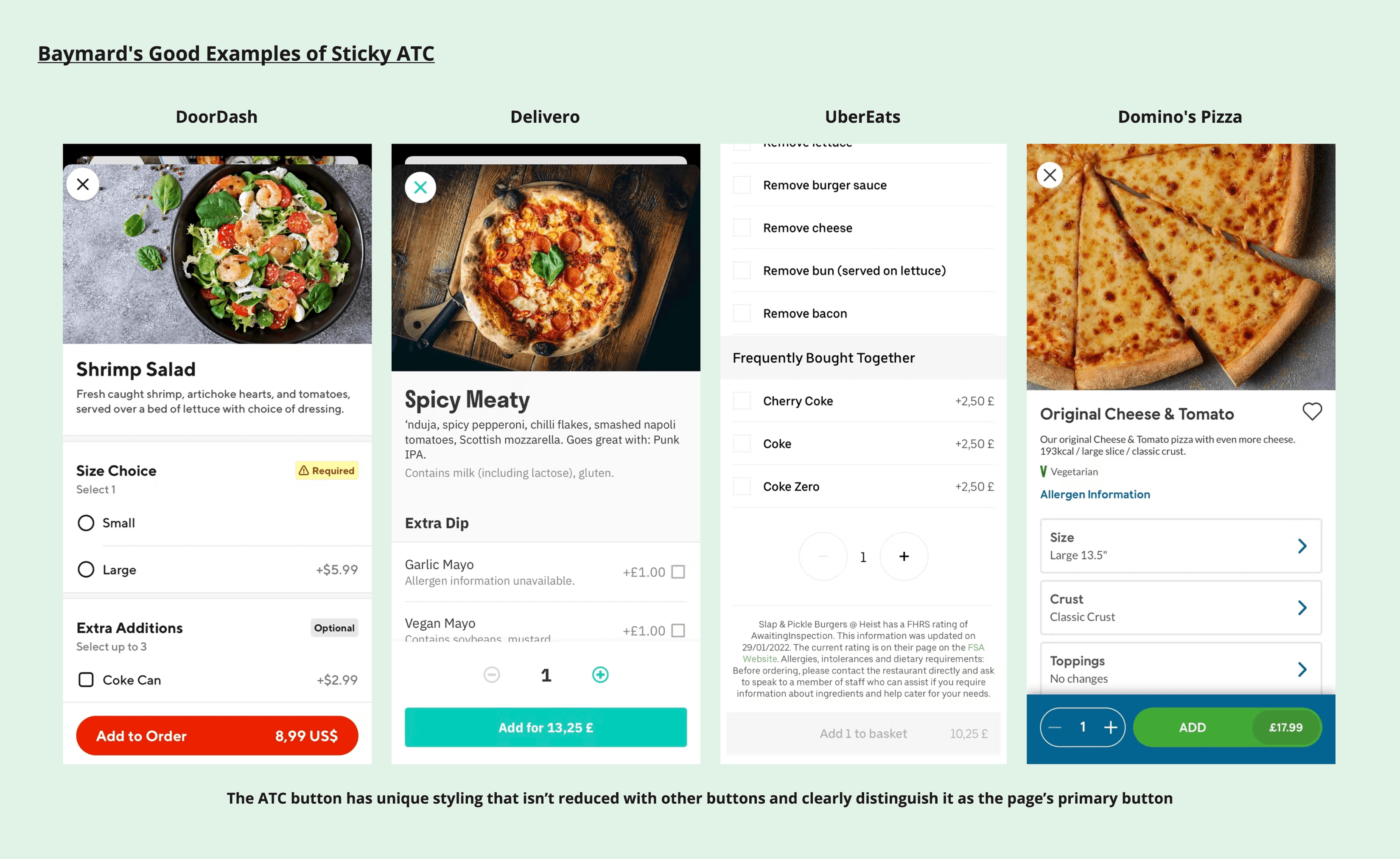
Key PIP Learnings:
Sticky ATC must be clearly styled and always visible.
Vertically collapsed sections should have clear, specific titles.
Recently viewed items help reduce navigation friction.
Key PLP/SRP Learnings:
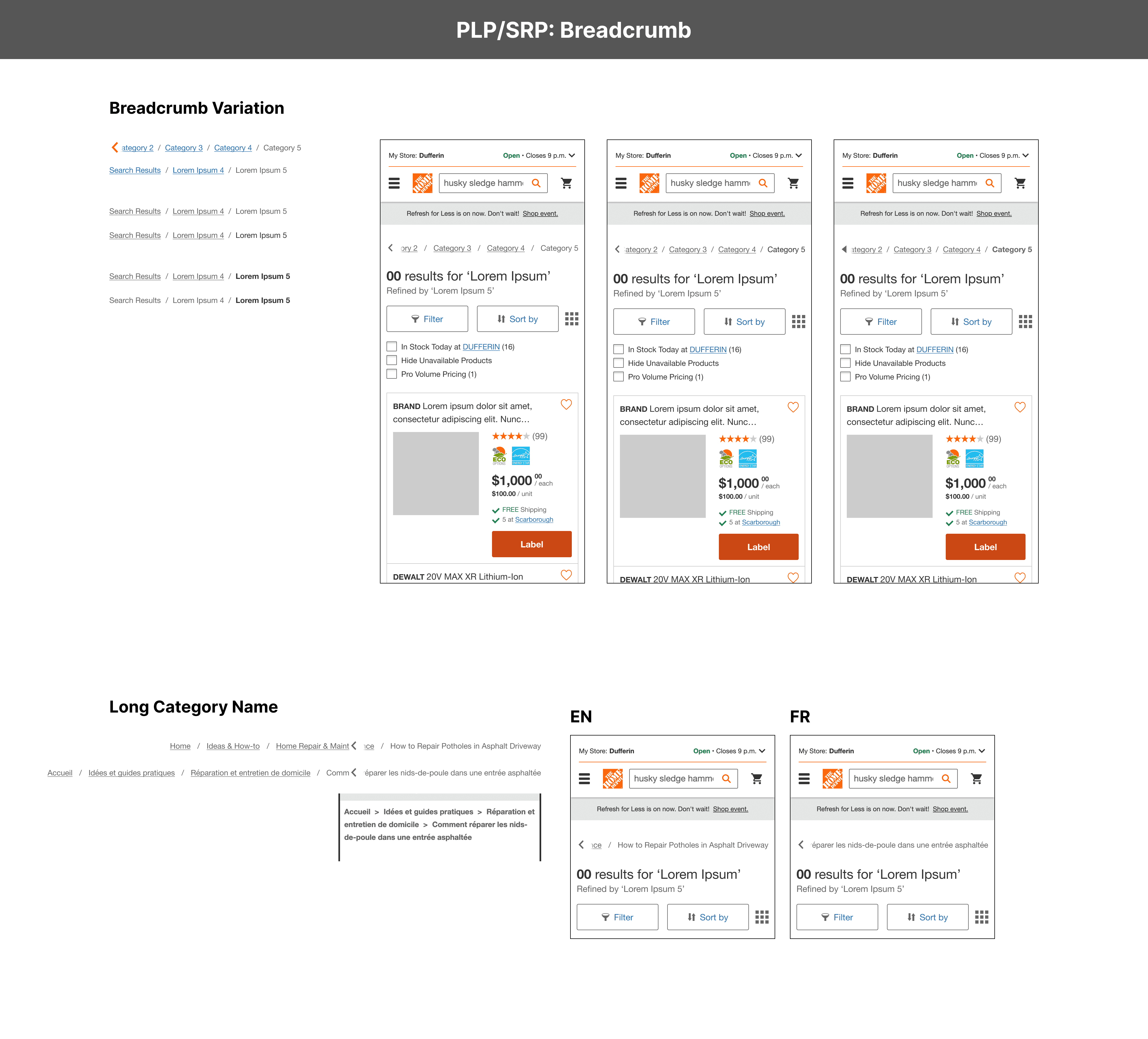
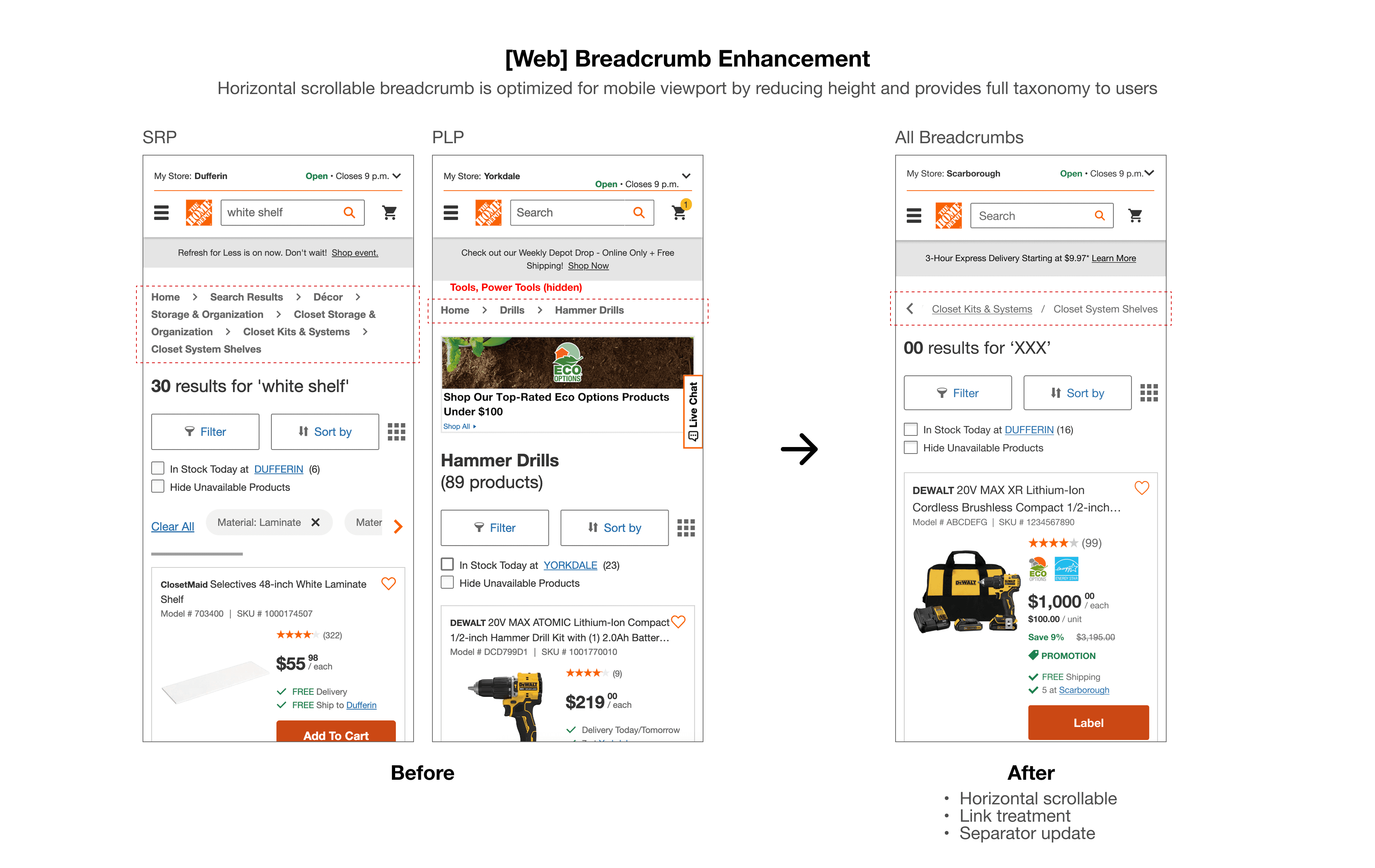
Breadcrumb on mobile should show the full hierarchy, and horizontal swipe should be considered.
Product comparison is less effective on mobile due to space limitations.

Competitor Research
We reviewed competitor mobile experiences (apps + mobile web), including Amazon, Wayfair, and Walmart, to benchmark layout structure, navigational patterns, and use of WebView. This helped validate our assumptions and identify gaps in our current experience, particularly around filters, breadcrumbs, and persistent navigation.
Evaluated Patterns:
PIP: Image handling, content layout, navigational links, etc.
PLP/SRP: List/grid toggles, sticky filters/sort, breadcrumbs, pagination, and facet behavior, etc.

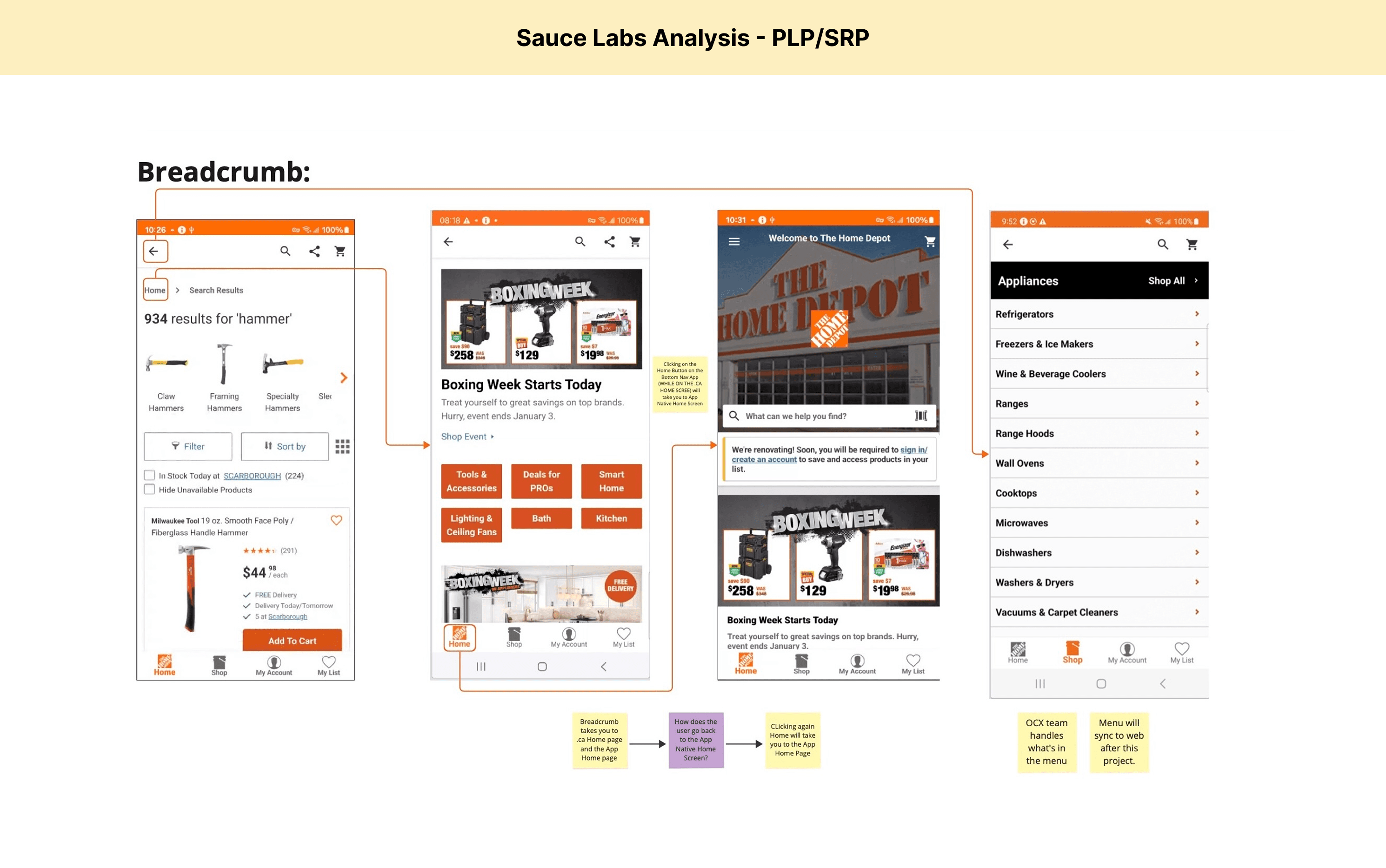
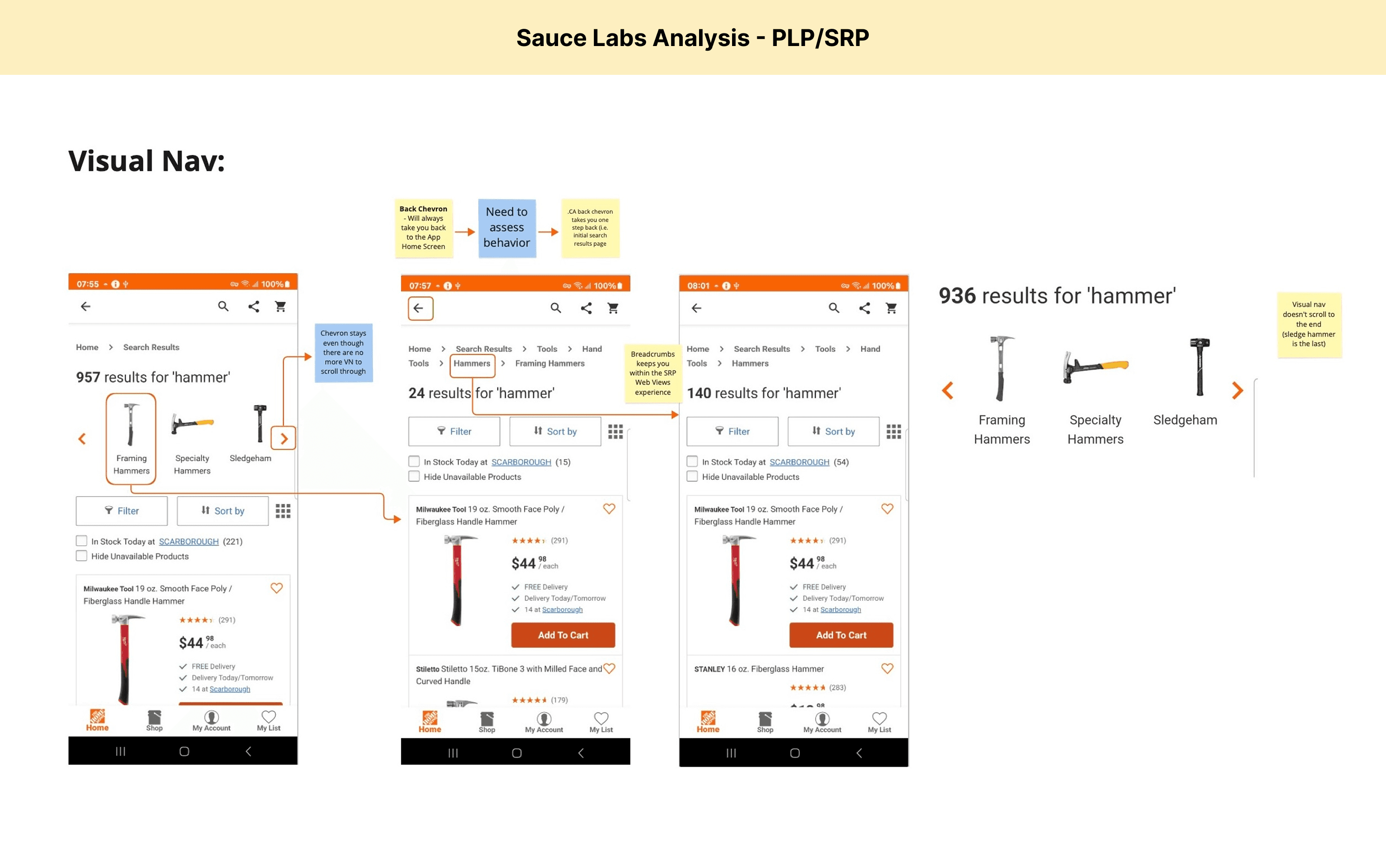
Webview Analysis with Sauce Labs
To better understand and visualize how the mobile web experience performs when rendered within the app, we used Sauce Labs, a cloud-based testing platform that allows us to run mobile applications in a virtual environment across real devices.
Using Sauce Labs, we embedded the existing HomeDepot.ca web experience into the native app without making any changes to the content. This allowed us to preview how the WebView would behave in context and identify potential issues early, such as layout inconsistencies, interaction conflicts, and performance/usability concerns.

Feature Prioritization
Building on earlier research findings, the UX team identified a range of features - some that could be seamlessly enabled in WebView, and others that required enhancements on the web or app side, or needed to be disabled altogether.
To better understand the scope and align on decisions moving forward, we facilitated a feature prioritization workshop. This activity directly addressed the core challenges of the project: gaining alignment across multiple stakeholders and product teams.
How the Workshop Worked
We invited stakeholders from various product teams and facilitated a live mapping exercise using a priority vs. effort matrix. The goal was to align on:
Which features were most critical to users.
What effort would each require across design and engineering.
Which trade-offs were we willing to make for scope.
The resulting layout was split into four decision zones:
Do It Now: High priority, low effort - include in scope immediately.
Do It Next: High priority, high effort - may be included based on available resources.
Do It If/When There’s Time: Low priority, low effort - backlog for later if time permits.
Don’t Do It: Low priority, high effort - exclude from scope.
Outcome
This exercise helped:
Clarify the scope and shared priorities.
Identify quick wins that could be enabled with minimal engineering lift.
Align cross-functional teams on technical constraints.
Provide a clear decision-making framework for the “grey area” features.


Ideation, Design, and Prototype
Ideation was approached as an iterative and modular process, with each round focused on a specific, well-defined opportunity or problem uncovered during earlier research. Rather than attempting to solve everything at once, we broke down the work into manageable parts, allowing us to explore ideas deeply, collaborate cross-functionally, and validate decisions as we went.
For each area of focus, we:
Revisited user flows to ensure alignment with user intent and technical feasibility.
Conducted additional competitive analysis when necessary.
Explored multiple design directions before narrowing in on a solution.
The design sprint:
Each round began with collaborative sketch sessions with stakeholders, followed by voting to select promising directions. Top concepts were developed into design variations, reviewed cross-functionally, and iterated into prototypes for validation and testing.
Below are some examples of the focus areas:
PIP Webview
Image Carousel Enhancements
Explored better mobile interactions, accessibility considerations, and swipe behavior across platforms.Product Information Layout
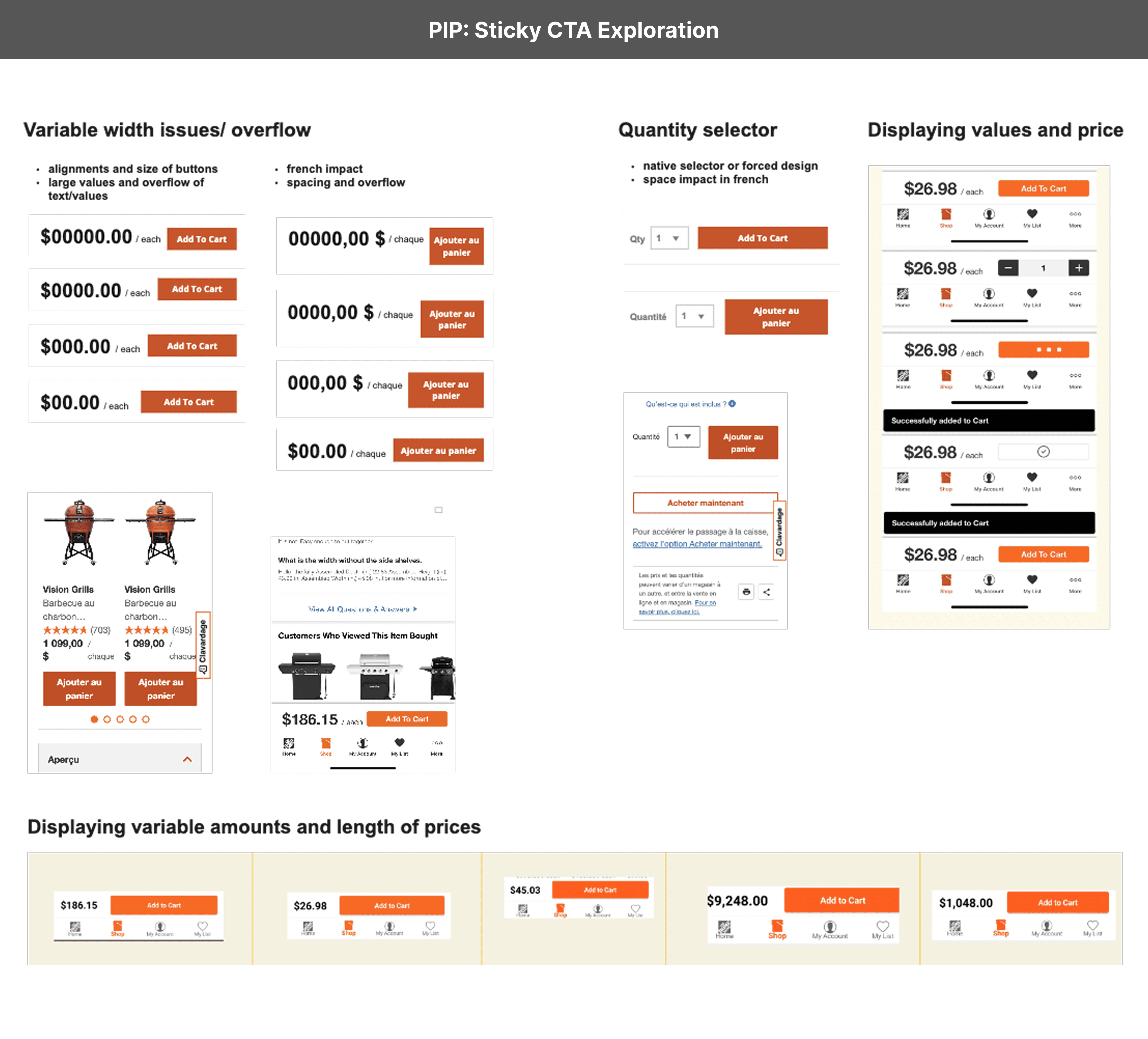
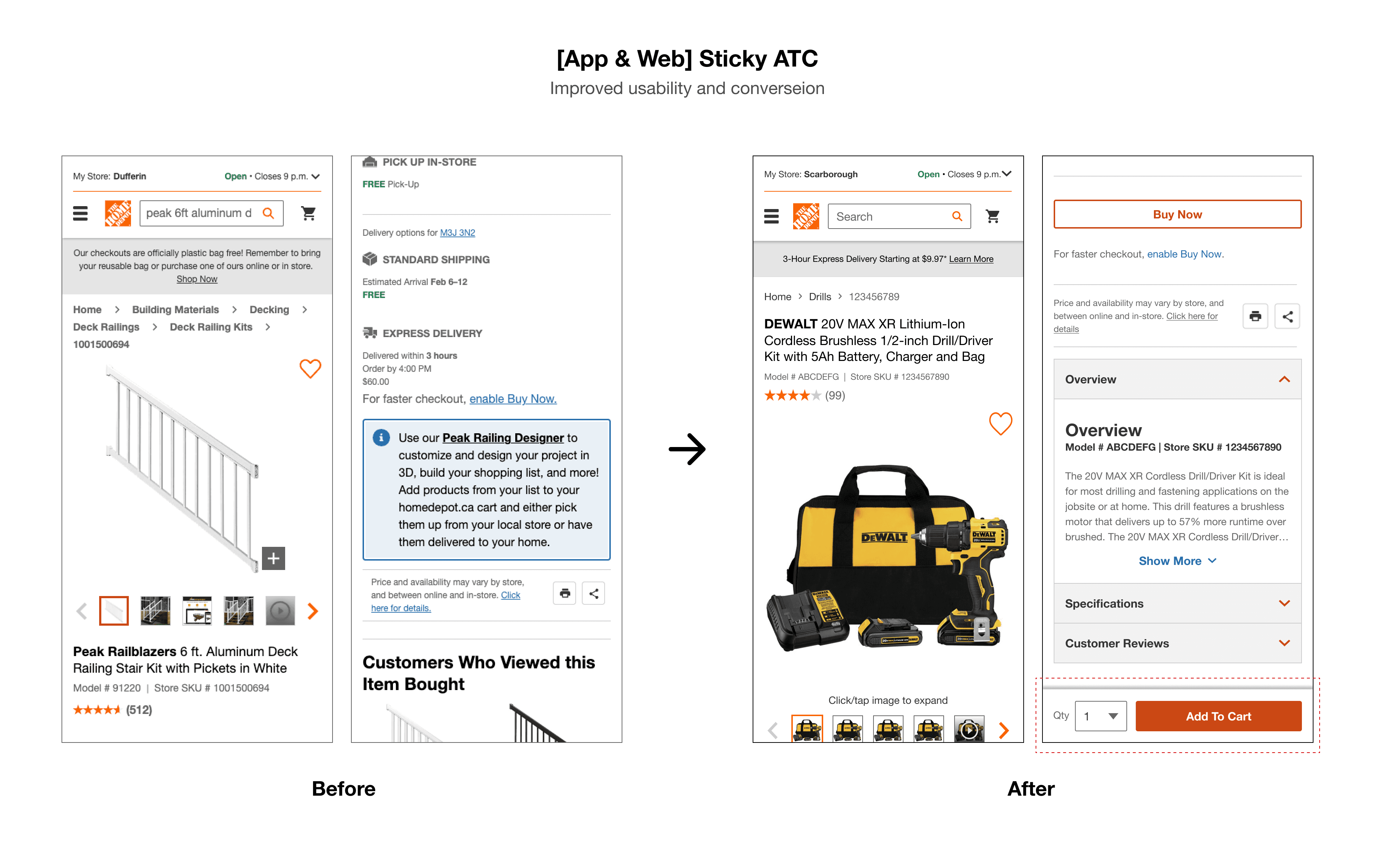
Reworked the structure of Overview, Specs, Reviews, Q&A, and Manufacturer’s Content to improve hierarchy and discoverability.Sticky Add to Cart CTA
Designed and tested multiple styles and placements, balancing usability with visual clarity.
PLP/SRP Webview
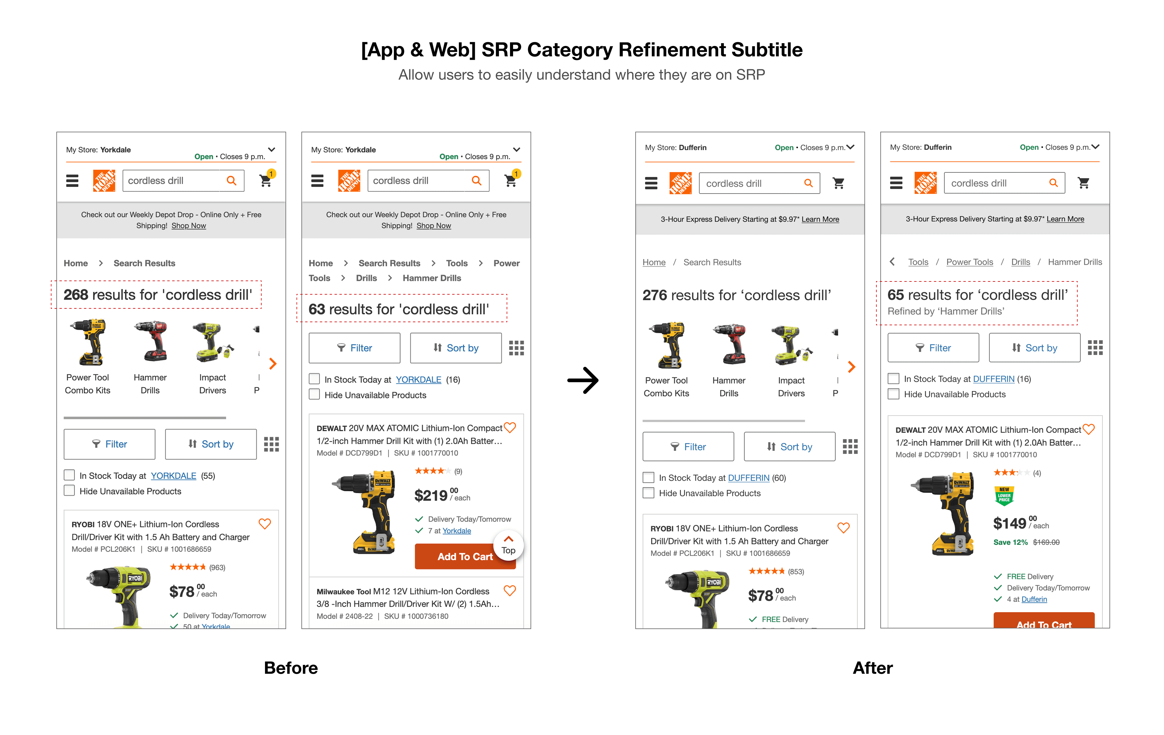
Category Refinement Subtitle
Introduced a visual indicator to help users understand when results were refined.Breadcrumb Enhancements
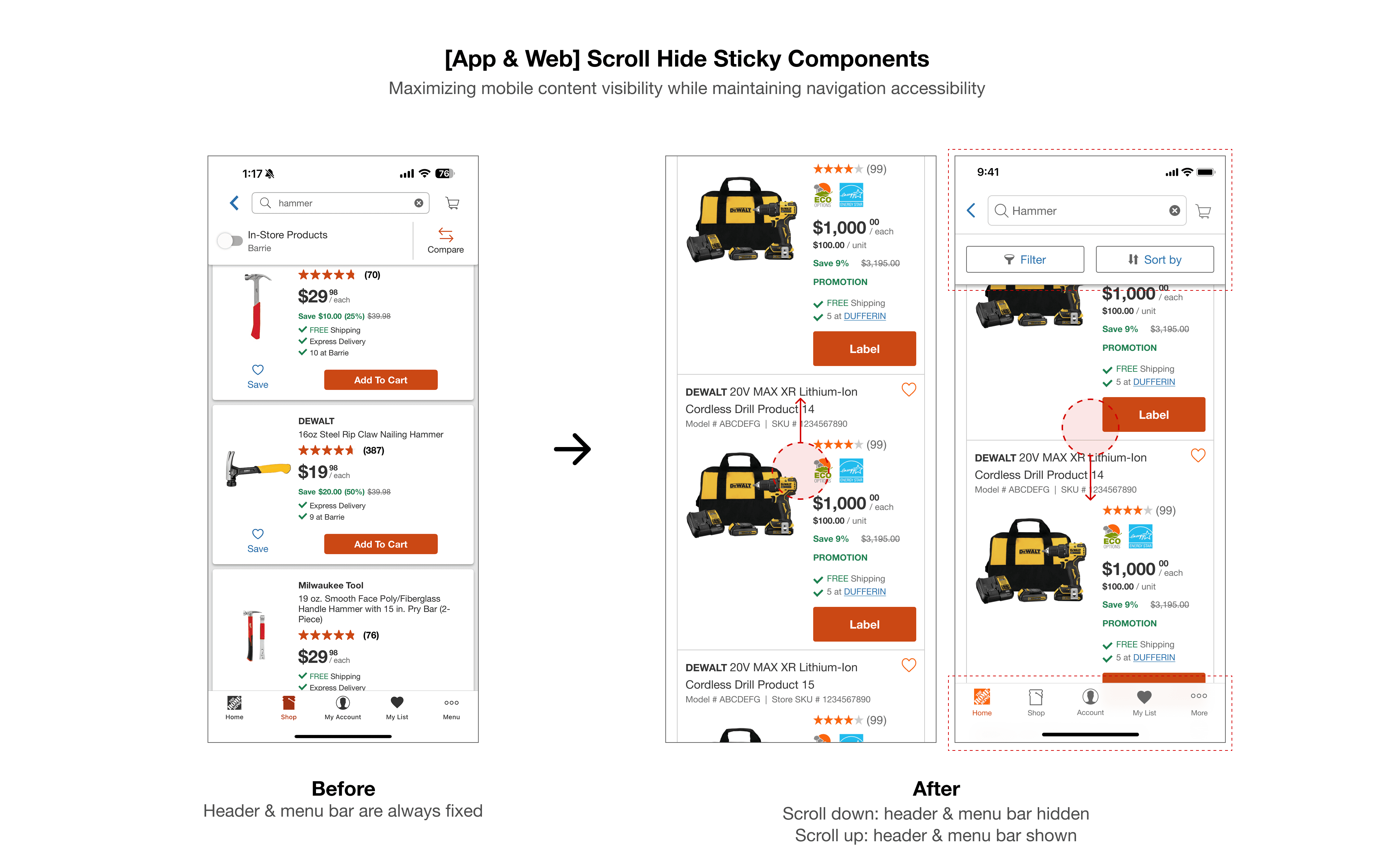
Improved UI and made them scrollable for better orientation and mobile fit.Scroll Hide/Show Sticky Header and Toolbar
Scroll-responsive UI to preserve navigation without compromising content visibility.Aisle & Bay Info (Web Only)
Onboarding App-specific feature onto the web to expand the usable feature to all users.


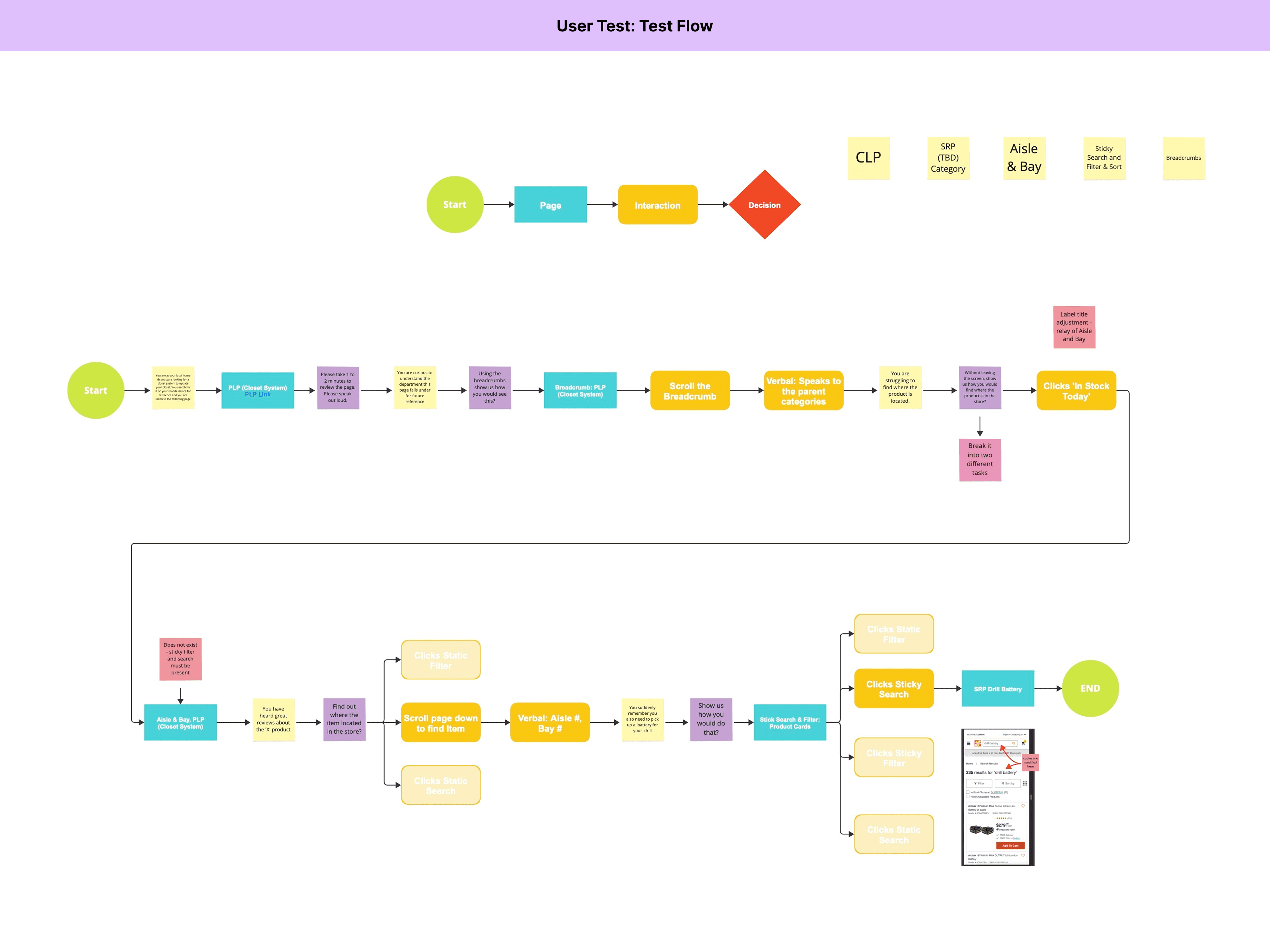
User Testing
To validate our design decisions and ensure a smooth transition to the WebView experience within the App, we conducted a series of unmoderated user tests.
PIP Webview
We tested enhancements on the most impactful components on the Product Information Page - Image Carousel and Product Information Layout, and the sticky Add to Cart (ATC) button.
What We Tested
Interaction with the image viewer and zoom functionality.
Ease of navigating between PIP and the image viewer.
Ability to find specific product details (e.g., Overview, Specs, etc.).
Perceived value of a sticky ATC button.
Key Insights
All users easily opened, zoomed in/out, and closed the image viewer.
Pinch to zoom was preferred over +/- icons.
The Overview and Specifications sections were easily found and accessed.
The sticky ATC button was seen as useful and convenient.
Panning within the image viewer was considered essential for closely examining product details.
Outcome
Move forward with implementing the enhanced design.
Include pinch-to-zoom and panning in the final image viewer experience.
PLP/SRP Webview
Due to concerns from senior leadership around navigation patterns, the PLP/SRP webview project involved multiple rounds of testing:
What We Tested
Determine if users understand when they’re viewing a refined assortment.
Evaluate whether users can confidently return to the full assortment.
Identify the most intuitive navigational methods (e.g., Back, Filter, Shop, Search, Visual Navigation).
Validate whether the updated design improves clarity and user flow.
Test Rounds
UT1 - Concept Testing (PLP)
We tested whether the absence of breadcrumbs in the app caused friction when navigating.UT2 - Concept Testing (SRP)
This round explored user expectations on the Search Results Page.UT3 - Solution Validation
After addressing issues from UT1 and UT2, we tested updated designs, including the addition of a refinement subtitle.
Outcome
UT1 & UT2 revealed a lack of orientation and heavy reliance on back/search behavior.
UT3 confirmed that adding a refinement subtitle significantly improved user clarity and confidence.


Final Enhancements Delivered
PIP Webview


PLP/SRP Webview

Measuring Success
The primary goal of this project was to transition native app experience to WebView-based PIP, PLP, and SRP, unlocking several key web features and continuing the journey toward feature parity between the app and HomeDepot.ca.
Here are the key projections regarding the project release:
R.I.C (Revenue Impact Calculation) based on 7% penetration
Relative lift in app penetration
Growth in MAU (Monthly Active User)
15+
New features unlocked on App PIP including:
Enhanced image viewer
Buy Now
BXSY-BXGY Promo
Virtual Bundles
Frequently bought together
SSKU (Super SKU)
UGC content
App optimized ATC Side panel experience with recommendations & more!
8+
New features unlocked on App PLP/SRP including:
Google CRS Integration - Enhanced search experience with improved relevance and speed
SSKU (Super SKU) on product cards
Aisle/bay information
Retail Media Banners - Monetized placements for curated promotions
PLP Virtual Bundles - Bundle visibility directly on listing pages
Dynamic Tags on PLP/SRP - Real-time product messaging (e.g., "Low Stock, "New")
Event & Category Landing Pages (ELPs/CLPs) - Personalized suggestions directly on PLP/SRP
How Do We Measure Success?
Building on projected revenue impact and adoption estimates, success will be measured through a combination of user engagement and business performance metrics:
Visits and Product Views
Feature Engagement
Cart Additions
Conversion Rate
Bounce Rate
Average Time Spent
PIP Webview Performance (Qualitative)
Since the PIP Webview project was released ahead of PLP/SRP Webview, our internal UXR team conducted a "PIP Webviews Pre & Post Benchmark Usability Test (Feb. 13, 2025)' to evaluate its impact.
Research Focus
The study assessed the findability of product information, specifically examining how recent structural changes affected user performance. Key updates included:
Relocating product information into a condensed preview section.
Moving vendor content further down the page in a collapsed state.
Placing cross-sell carousels after core product details.
Methodology
65 mobile users were tested, and they were tasked to locate specific product details within product information section.
The key metrics were:
Speed of finding (Time on Task)
Task Completion (Success Rate)
Task Ease (Ease Level)
Results
The post-enhancement experience outperformed the pre-enhancement version across all key metrics:
Faster task completion (reduced time on task)
Higher accuracy (increased success rate)
Improved user perception (higher ease ratings)
These findings validated the design changes and confirmed that the new product information structure improved both usability and efficiency for mobile users.